Comment

Chip cards, the Tenerife disaster, and bad UI

In 1977, two fully loaded 747’s collided on the runway at Tenerife North Airport, killing 583 people. As of 2018, it remains the worst disaster in aviation history. As with any engineering failure, many factors had to align to defeat all the safeguards. The primary factor was heavy fog; as the KLM 747 was rolling down the runway for takeoff, visibility was only a few hundred meters. So they didn’t see the PanAm 747 — which was still on the runway — until it was too late. But why was the KLM 747 taking off when the PanAm 747 was blocking its path?

“Departure” versus “Takeoff”

Another factor that doomed the two planes was a communication problem. The KLM plane had lined up at the end of the runway, and was impatient to takeoff before the crew maxed out their on-duty time (which would have required a replacement crew). The KLM plane radioed to the tower “We are now at takeoff,” to which the tower replied “OK … {Stand by for takeoff, I will call you}.” The latter part of the tower’s response is in braces because it was inaudible to the KLM crew. Instead, they heard the SQUEAL of radio interference. This SQUEAL was caused by the PanAm 747 interjecting “No! Eh? We are still taxiing down the runway!" Fatefully, the KLM 747 interpreted “OK” as a takeoff clearance and began to roll.

The fire burned for several hours, but luckily the KLM’s cockpit voice recorder survived. It revealed that the KLM captain had begun takeoff unilaterally, even though his copilot thought the tower’s message was ambiguous. But the captain was KLM’s chief flight instructor, so instead of calling “Abort” to end the takeoff until a proper clearance had been received, the copilot deferred to his senior. This fact revolutionized the airline industry, leading to the formal development of Crew Resource Management (CRM), a discipline which studies how humans communicate and perform under stress, and the most efficient way to delineate tasks among the flight crew. One of the major changes was to radio procedures. The word “takeoff” is now only used by the control tower, and only when giving (or cancelling) a takeoff clearance. In all other situations, the word “departure” is used in in its place (e.g., “Line up for departure” or “We are ready for departure.”). This rule dramatically reduces ambiguity on a crackling, low-fidelity radio.

What does this have to do with chip cards?

If you’re like me, you’re also impatient to “take off” from the checkout line at the store. And if you’re like me, you pay for everything with a credit card, then kill off your balance after every statement. Enter the chip card, which must remain inserted in the point-of-sale reader … until the machine starts beeping loudly because it is time to remove it. I find this beeping extremely annoying, and am usually trying to put my wallet away so I can resume bagging, so I always try to rip my card from the reader as soon as possible. But sometimes I remove the card too soon, and doom myself to repeating the failed transaction. Clearly, this has happened to me often enough that I spent 30 minutes blogging about it. So what can be done?

The word remove should only appear when it is time to remove the card. I often see readers displaying messages like “Don’t remove card”, and these messages often inexplicably jump around the screen. My brain sees the word “remove” suddenly appear, and I yank the card out. If we learn from Tenerife, “remove” should be a reserved word, just like “takeoff”. In my opinion, the following rules will dramatically improve the user interface of chip card readers.

  • There should only be two messages when the card is inserted. “Keep card inserted.” and “Please remove card.” This reserves action words for their specific context, and intentionally avoids negation (i.e., “Don’t remove card”) which is another layer of complexity to parse.

  • Messages should always be in the same place/line on the screen, and should not jump around.

  • The two messages should emphasize their differences; the words “inserted” and “remove” should be bolded. Additionally, one message should be black on white, and the other white on black (or some similar change in background that indicates a time for action).

  • The beeping should start calmly (like a chime or ding), and only become really annoying when the card has not been removed after a few seconds.

An encyclopedia of failures

As a final though, the internet is an extremely powerful tool, and resources like Wikipedia make it extremely easy to disseminate humanity’s collective wisdom. However, a fundamental problem with the way knowledge is organized is that it often focuses on “what works” or “this is how you do it.” Little attention is paid to “what failed” or “don’t do it like this.” In the past, when all knowledge was printed (expensively) on paper, this strategy made sense, as there was only room for the winners. But now that information is cheap and plentiful, we have room for all those losers. Because humanity’s collective failures have an important purpose; to teach us what didn’t work, lest we make the same mistake again.

Comment

$\setCounter{0}$

1 Comment

Beware of craigslist ads with the email in the picture

I am moving across the country, and the most economical way (if you have an SUV with a hitch) is to rent a trailer and haul it yourself. Those pods are expensive. But what if you could buy a cheap trailer on craigslist, move your stuff, then sell it for the same price at the other end? The only cost would be the title transfer and registration (about $120). I've gotten some neat stuff on craigslist recently, so it seemed like a plan worthy of a quick five minute search.

A 5x8, enclosed trailer (designed to haul motorcycles).

A 5x8, enclosed trailer (designed to haul motorcycles).

So I looked around Chicago and almost immedietely found a really cheap trailer. I contacted the seller, and quickly got a bunch of pictures. The trailer is in great condition! They even were willing to do free delivery (cause they were very firm on the price). I replied seeking information about the trailer's gross weight, because my SUV can only tow a certain amount; the higher the trailer weight, the less stuff I can bring. Another quick reply ... except they didn't answer my question. Instead, they sent a really long email about how we would have to use some eBay escrow, because they were at an air force base training for a deployment to Syria. Luckily, eBay could deliver the trailer anywhere, and "by dealing through eBay, we are both covered 100% and nothing wrong can happen." All I had to do was tell her my name and address and she would have eBay contact me to set up the sale. Right ... nothing wrong can happen.

So this email (immediate, very long, not even related to my question, no face-to-face meeting, dealing through third party, eBay on craiglist) set off all the alarm bells. And then I started thinking about the original listing. It was a picture of the trailer with the seller's email in the picture. Now, if you're going to expose your real email, why would you embed it in the picture, instead of in the details. To prevent that email to be text-searchable by fraud-detection bots? Bingo! Because in five minutes I found the same trailer for sale in:

New York!

Trailer_NewYork.png

Orlando!

Trailer_Orlando.png

And Palm Springs!

Trailer_PalmSprings.png

And always the same seller: our beloved Tracy, fighting overseas for our freedom at home. But first, she just needs to unload this one little trailer, so she decided to post it EVERYWHERE.

So remember folks. If your craigslist seller is putting their email in the picture, it's probably because they're trying to obfuscate their email address from a simple text search. Of course, the price was way too good to be true, which should have been my first hint that something was amiss. Oh well, I guess I'll have to rent from UHaul.

1 Comment

$\setCounter{0}$

Comment

How dismantling net neutrality can backfire dramatically

Today, the internet is as important as public roads

The FCC recently announced it plans to get rid of "net neutrality"; rules that require internet service providers (ISPs) to act as a common carrier. Net neutrality means that AT&T can't discriminate against certain websites and throttle their content (or block it altogether), while promoting other websites by not throttling them. On a neutral network, all traffic is created equal. The FCC wants to get rid of net neutrality because the FCC (and all their lobbyists) say it will be good for business, using the standard conservative argument that less regulation is always better.

First off, I'm rather conservative myself, and I detest unnecessary regulation. For example, I think deregulating the airline industry in the 1978 was a good thing. There's no need for the federal government to say which airlines can fly which routes. On the other hand, I am a proponent of the EPA, because I know that in practice cold-blooded capitalism is only concerned with the next few quarters, and when the hammer falls 20 years from now, the board of directors which covered up the toxic spill will be comfortably retired or dead. The cover up is good for their bottom line.

I'm a proponent of net neutrality because, in the modern world, the internet is just as important as roads. It would be unreasonable for people to expect city government to ensure that there's a Walmart in their town, but it's quite reasonable to expect that the city will maintain the road that leads to the neighboring city that has the Walmart. Now, there's no constitutional principle which says that the people have a right to public roads. But I think we can all agree that it is best to keep critical infrastructure in the public trust. Of course, one might argue that public roadways are not enough, you also need a car. But in our metaphor where the internet is roads, then laptops and smartphone are the cars — most people already own a car (if not five).

Anonymized internet traffic reinstates net neutrality

Here's how I predict the repeal of net neutrality will backfire. Big shots at Google, Facebook and Apple don't like the idea. They like to believe they act ethically (whether this is true or not), so they will use their impressive influence to anonymize internet communication. If your ISP can't tell where your packets came from, they can't throttle the one's from the sites they wish to "un-promote". Of course, the ISPs can tell when traffic is anonymized, so they will retaliate by blocking anonymized traffic altogether. But the big tech companies have the upper hand; they will require anonymized traffic (i.e. they won't communicate with you unless you're anonymized). Hence, any ISP which blocks anonymized content will also be blocking Google, Facebook, etc. And when the angry mob shows up at the door, the ISPs will be forced to unblock.

If you don't believe that big tech companies could require anonymized traffic, look no further than HTTPS. Ten years ago, all of our internet traffic was floating around mostly unencrypted. If someone intercepted my communication with Wikipedia, they could see what I was looking at. Now they can't, because Wikipedia uses encrypted traffic by default. And if you browse with Google Chrome, it actually warns you when a website isn't using HTTPS — with big red letters.

Expanding upon that real-world example, let me construct a hypothetical anonymization scenario. In 2018, Google releases a new version of Chrome which has the capability to automatically anonymize traffic (just like HTTPS, the user doesn't have to do anything to get it to work). Then they require that if you're talking to Google servers using anonymized Chrome, you must use anonymized content. Of course, to use your Gmail you'll still have to give Google your identity, but this identity will be buried deep within your anonymized, encrypted traffic; a generic eavesdropper won't be able to tell who you're talking to or who you are. Your ISP will know who you are, but not who you're talking to.

The fallout

And here's how this all backfires for big business. If everyone is anonymized online, they can't sell us targeted advertisement. Period. If people have the option of being anonymous, no one will want to "opt in" to reveal their identities to the websites they're visiting. And we all know that targeted ads are a lot more effective than random ones.

Ironically, Google will still be able to track us (given this Chrome example) because Chrome will still know exactly where we visit and Google servers will still read our Gmails. But as usual, Google won't sell that data externally. They'll use the data internally to make sure that only people interested in buying cars see car ads, forcing car dealers and manufacturers to buy ads through Google, instead of implementing their own. Given that fat incentive, I'd be surprised if Google isn't burning the midnight oil to launch anonymized Chrome in 2018.

Of course, there will be criminals who aren't using Chrome, and instead are using a free, "totally anonymous" browser. And try tracking down hackers and child predators once the entire internet is anonymous. It may have been possible to defeat anonymization when the traffic analysis could restrict itself to the tiny fraction of traffic which was actually anonymized. But if everything is anonymized, good luck.

Now, this is all hypothetical, based upon a very limited understanding of how anonymization actually works, and a lot of assumptions. But it seems plausible to me. So, if big business really had their own interests at heart, they might try supporting net neutrality. But as usual, they're mostly concerned with trying to boost growth in Q1, so they can't see the bigger picture. I guess that's one of the perks of being a wallflower.


Comment

$\setCounter{0}$

Comment

Which came first, the bug or the feature?

We live in a world of software, and every day humanity becomes more dependent on it. This creates a never-ending problem; new versions of software introduce new features (you can do this now!), but new features introduce new bugs. The worst is when the bug breaks something that used to work, and you didn't even want that new feature anyway! Even worse, sometimes the bug is subtle, and takes a while to find, and surreptitiously ruins a bunch of work in the meantime. So what can we do to fix this problem? It's time for a new paradigm.

Does old = stable?

My laptop's operating system is CentOS 7, a version of Linux based on Red Hat Enterprise Linux, which is itself a notoriously stable version of Linux designed for large-scale commercial use (think server room). The virtue of CentOS is stability. It is supposed to have all the bugs worked out. So unlike Fedora, my previous OS, it shouldn't randomly crash on me.

A downside to this stability is that many of the free programs distributed with CentOS are meant to be extra stable, which means they are generally a few years old. So even though the GNU Compiler Collection (gcc) is up to version 7.2, I only have version 4.8. And that's fine, I don't need the new features available in gcc 7.2.

Another program I frequently use is a mathematical plotting program called gnuplot (not associated with GNU). gnuplot makes superb mathematical figures (lines and scatter plots) and I use it for all of my physics papers. Because CentOS 7 is stable, it comes with gnuplot 4.6.2 even though gnuplot's official "stable" version is 5.2. Again, I'm willing to sacrifice features for stability, so I don't mind missing out on all the hot new stuff in 5.2

But this model — using older versions because they're more stable — doesn't always work. Because there's a bug in gnuplot 4.6.2. The details aren't important; it's a rather small bug, and it's already been fixed in future versions. Nonetheless, the bug is there, and it's annoying.

This brings me to my observation. Software comes in versions (v 4), and sub-versions (v 4.6), and sub-sub-versions (4.6.2). The idea is that big new features require new versions, lesser features sub-versions, and bug fixes only need a new sub-sub-versions. But this doesn't always hold true, and it's a difficult system to manage.

In this system, CentOS updates have to manually added to the CentOS repositories. New versions can't automatically be added, because they might add new features. How do the CentOS developers know that 4.6.3 only fixes bugs, and doesn't add any features? They have to manually read the release notes of every supported program and manually add sub-sub-versions which only fix bugs. This is probably why CentOS is still using gnuplot 4.6.2 when it should be using 4.6.6 (the most recent patchlevel). 

Furthermore, perhaps I as a user only want one new feature from 5.1, and could care less about all the rest. And what if it's the features I don't want that introduce the bugs? In this scenario, I upgrade to 5.1, which is mostly a bunch of stuff I don't want, and get a bunch of bugs I definitely didn't want.

New Features and Bug Fixes

This brings me to the new paradigm I wish to endorse. This idea is not new to me, and I probably wasn't the first human to have it, but I don't have time to scour the internet to give credit. Which means you don't have to give me any.

Features should be kept separate from bug fixes. Since new features depend on old features (feature XYZ depends on feature XY), features will have to exist in a dependency tree, with a clear hierarchy ascending all the way back to the minimal working version of the program (the original feature). With the tree in place, it should be possible to associate every bug with only one feature — the feature that broke the code when it was implemented. So even if a bug is only discovered when you add feature XYZ, if the bug was introduced in feature XY (and has been silently wreaking havoc), you can fix it in feature XY and apply it to all versions of the program using feature XY.

This paradigm is similar to the current model (versions, sub-versions), but notably different in that I can pick and choose which features I want. The dependency tree takes care of getting the necessary code (and making sure everything plays nice). With this paradigm, I only subject myself to the bugs introduced by the features I actually want. And when bugs are discovered in those features, I can automatically patch the bugs without worrying that the patch introduces new features which introduce their own subtle bugs. 

Managing the dependency tree sounds like a bit of a nightmare, at least until someone changes git to easily follow this paradigm. At that point, I would say that the whole thing could become pretty automatic. And that way, if gnuplot pushes some bug fixes to some old features, CentOS repositories can automatically snatch them up for my next CentOS update. No manual intervention needed, and this annoying gnuplot bug doesn't persist for months or years.

Of course, in proposing this paradigm I am committing the ultimate sin; declaring that things should work some way, but with no intention of implementing it. But what can I do? I'm a physicist, not a computer scientist. So the best I can do is yak and hope the right person is listening.

Comment

$\setCounter{0}$

1 Comment

Why the news needs better statistics

I awoke this morning to my daily routine $-$ check Slashdot; check Google news; open the Chicago Tribune app. In the Trib there was much ado about politics, interesting as usual, but the story that caught my eye was "Study: Illinois traffic deaths continue to climb," by Mary Wisniewski (warning: link may be dead or paywalled). The article's "lead" provides a good summary: "A study of traffic fatalities nationwide by the National Safety Council, an Itasca-based safety advocacy group, found that deaths in Illinois went up 4 percent in the first half of 2017, to 516 from 494, compared to the first six months of last year. The national rate dropped 1 percent for the same period." Now, before you read the rest of this blog, ask yourself: Does the data presented in this quote imply that drivers in Illinois are becoming more reckless, while the rest of the nation is calming down?

There's another way to phrase this question: Is the 4% increase between the two half-years statistically significant? The simple answer is no. However, this does not mean that traffic deaths are not rising; there is good evidence that they are (with an important caveat). But to reach this conclusion, we need to examine more data, and do so more carefully. Unfortunately, a careful examination requires discussing Poissonian statistics, which is admittedly heavy. But with the lay reader in mind, I'll try to keep the math to a minimum.

Poissonian statistics and error bands

Poissonian statistics describe any process where, even though events occur with a known, constant rate \begin{equation}\lambda=\frac{\text{events}}{\text{sec}},\end{equation}you can't predict when the next event will occur because each event happens randomly and independently of all other events. To make this definition clearer, we can examine radioactive decay.

Watch this video of a homemade Geiger counter, which makes a click every time it detects an atom decaying. When the radioactive watch is placed next to the sensor, you should notice two things:

  1. The clicks seem to follow a constant, average intensity. The average noise from the counter is more-or-less constant because the decay rate $\lambda$ is constant.
  2. Within the constant noise level are bursts of high activity and low activity. The decays are kind of "bunchy".

It is important to properly interpret #2. A cadre of nuclei do not conspire to decay at the same time, nor do they agree not to decay when there are stretches of inactivity. Each atom decays randomly and independently; the "bunchiness" is a random effect. Every so often, a few atoms just happen to decay at nearly the same time, whereas in other stretches there are simply no decays. 

We can make more sense of this by pretending there's a little martian living inside each atom. Each martian is constantly rolling a pair of dice, and when they roll snake eyes (two 1s) they get ejected from the atom (it decays). Snake eyes is not very probable (1 in 36), but some martians will get it on their first roll, and others will roll the dice 100 times and still no snake eyes. And if we zoom out to look at many atoms and many martians, we'll occasionally find several martians getting snake eyes at nearly the same time, whereas other times there will be long stretches with no "winners".

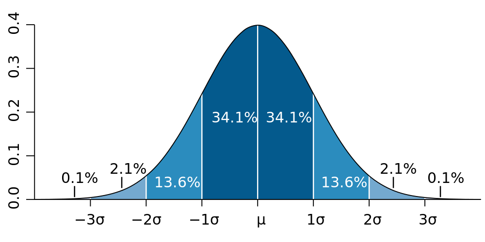
The "bell curve" (normal distribution). The height of the curve denotes "how many" things are observed with the value on the $x$-axis. Most are near the mean $\mu$.

The "bell curve" (normal distribution). The height of the curve denotes "how many" things are observed with the value on the $x$-axis. Most are near the mean $\mu$.

Returning to reality, imagine using the Geiger counter to count how many atoms decay in some set time period $\Delta t = 10\,\text{s}$. If we know the average rate $\lambda$ that the radioactive material decays, we should find that the average number of nuclear decays during the measurement period is\begin{equation}\mu=\lambda\,\Delta t\end{equation}(where we use the greek version of "m" because $\mu$ is the mean). But the decays don't tick off like a metronome, there's the random bunchiness. So if we actually do such an experiment, the number $N$ of decays actually observed during $\Delta t$ will probably be smaller or larger than our prediction $\mu$. Our accurate prediction (denoted by angle brackets) needs a band of uncertainty \begin{equation}\langle N \rangle = \mu \pm \sigma,\end{equation}where $\sigma$ is the error. Numbers quoted using $\pm$ should generally be interpreted to indicate that 68% of the time, the observation $N$ will fall within 1 $\sigma$ of the predicted mean. While this requires 32% of experiments to find $N$ outside $\mu\pm\sigma$, 99.7% of them will find $N$ within $\mu\pm3\sigma$. These exact numbers (68% within 1 $\sigma$, 99.7% within 3 $\sigma$) are due to the shape of the bell curve, which shows up everywhere in nature and statistics.

Poisson found that for Poissonian processes (constant rate $\lambda$, but with each event occurring at a random time), the number of events observed in a given time exactly follows a bell curve (provided $\mu$ is larger than about 10). This allows us to treat Poisson processes with the same kind of error bands as the bell curve, with the predicted number of events being\begin{equation}\langle N\rangle = \mu \pm \sqrt{\mu}\qquad(\text{for a Poisson process, where }\mu=\lambda\,\Delta t\text{)}.\label{Ex(Poiss)}\end{equation}This equation is the important result we need, because Eq. \eqref{Ex(Poiss)} tells us the amount of variation we expect to see when we count events from a Poissonian process. An important property of Eq. \eqref{Ex(Poiss)} is that the relative size of the error band goes like $1/\sqrt{\mu}$, so if $\mu=100$ we expect observations to fluctuate by 10%, but if $\mu=10,000$ the statistical fluctuations should only be about 1%.

Traffic fatalities are a Poissonian process

It is difficult to use statistics to dissect a subject as grim as death without sounding cold or glib, but I will do my best. Traffic accidents are, by definition, not intended. But there is usually some proximate cause. Perhaps someone was drunk or inattentive, maybe something on the car broke; sometimes there is heavy fog or black ice. Yet most traffic accidents are not fatal. Thus, we can view a traffic death as resulting from a number of factors which happen to align. If one factor had been missing, perhaps there would have been a serious injury, but not a death. Or perhaps there would have been no accident at all. Hence, we can begin to see how traffic deaths are like rolling eight dice (one die for each contributing factor, where rolling 1 is bad news). While rolling all 1s is blessedly improbable, it is not impossible. Of course some people are more careful than others, so we do not all have the same dice. But when you average over all drivers over many months, you get a more or less random process. We don't know when the next fatal accident will occur, or to whom, but we know that it will happen. Hence we should use Poissonian statistics. 

We can now return to the numbers that began this discussion; in Illinois, 516 traffic deaths occurred in the first half of 2017 and 494 in the first half of 2016. If these numbers result from a Poissonian process, we could run the experiment again and expect to get similar, but slightly different numbers. Of course we can't run the experiment again. Instead, we can use Eq. \eqref{Ex(Poiss)} to guess some other numbers we could have gotten. Assuming that the observation $N$ is very close to the mean, we can put an error band of $\sqrt{N}$ around it. This assumption of proximity to the mean is not correct, but it's probably not that bad either, and it's the easiest way to try to estimate the statistical error of the observation.

Presenting the same numbers with errors bands, $516\pm23$ and $494\pm22$, we can see that two numbers are about one error band apart. In fact, $516=494+22$. Using the fact that relative errors add in quadrature for a quotient (if that makes no sense, disregard it), the relative increase in Illinois traffic deaths from 2016 to 2017 was $4.4\%\pm 6.3\%$. So it is actually quite probable that the increase is simply a result of a random down-fluctuation in 2016 and a random up-fluctuation in 2017. This immediately leads us to an important conclusion:

Statistics should always be quoted with error bands so that readers do not falsely conclude they are meaningful.

On the other hand, just because the increase was not statistically significant does not mean it wasn't real. It just means we cannot draw a lot of conclusions from these two, isolated data points. We need more data.

Examining national traffic deaths

The National Safety Council (NSC) report quoted by the Chicago Tribune article can be found here (if the link is still active). I have uploaded the crucial supplementary material, which contains an important third data point for Illinois $-$ there were 442 deaths in the first half of 2015. This tells us that the number of deaths in 2017 increased by $17\%\pm6\%$ versus 2015. Since this apparent increase in the underlying fatality rate is three times larger than the error, there is only a 3 in 1000 chance that it was a statistical fluke. The upward trend in traffic deaths in Illinois over the past two years is statistically significant. But Illinois is a lot like other states, do we see this elsewhere? Furthermore, if we aggregate data from many states, we'll get a much larger sample size, which will lead to even smaller statistical fluctuations and much stronger conclusions.

Fig. 2: USA traffic deaths per months, per the NSC. Each month depicts the observed number of deaths $\pm$ Poissonian error (the bar depicts the error band of Eq. \eqref{Ex(Poiss)}).

Fig. 2: USA traffic deaths per months, per the NSC. Each month depicts the observed number of deaths $\pm$ Poissonian error (the bar depicts the error band of Eq. \eqref{Ex(Poiss)}).

The same NSC report also contains national crash deaths for every month starting in 2014 (with 2013 data found in a previous NSC report). Plotting this data in Fig. 2 reveals that aggregating all 50 states gives much smaller error bands than Illinois alone. This allows us to spot by eye two statistically significant patterns. There is a very clear cyclical pattern with a minimum in January and a maximum near August. According to Federal Highway Administration (FHA) data, Americans drive about 18% more miles in the summer, which helps explain the cycle (more driving means more deaths). There is also a more subtle upward trend, indicating a yearly increase in traffic deaths. In order to divorce the upward trend from the cyclical pattern, we can attempt to fit the data to a model. The first model I tried works very well; a straight line multiplied by a pseudo-cycloid\begin{equation}y=c\,(1 + x\,m_{\text{lin}})(1 + \left|\sin((x-\delta)\pi)\right|\,b_{\text{seas}}).\label{model}\end{equation}Fitting this model to data (see Fig. 3) we find a seasonal variation of $b_{\text{seas}}= 35\%\pm3\%$ and an year-to-year upward trend of $m_{\text{lin}}= 4.5\%\pm0.5\%$. Both of these numbers have relatively small error bands (from the fit), indicating high statistical significance.

 
Fig. 3: USA traffic deaths per months, per the NSC, fit to Eq. \eqref{model}.

Fig. 3: USA traffic deaths per months, per the NSC, fit to Eq. \eqref{model}.


Explaining the Upward trend

Fig. 4: Trillions of miles driven by Americans on all roads per year, using FHA data. Figure courtesy of Jill Mislinski.

Fig. 4: Trillions of miles driven by Americans on all roads per year, using FHA data. Figure courtesy of Jill Mislinski.

What can explain the constant 4.5% increase in traffic deaths year-over-year? If we examine the total number of vehicle miles travelled in the past 40 years in Fig. 4 (which uses the same FHA data), we can very clearly see the recession of 2007. And based on traffic data, we can estimate the recovery began in earnest in 2014. Fitting 2014 through 2017, we find that the total vehicle miles travelled has increased at an average pace of 2.2% per year for the last 3 years. More people driving should mean more deaths, but 2.2% more driving is not enough to explain 4.5% more deaths.

Or is it? My physics background keyed me in to a crucial insight. Imagine that cars are billiard balls flying around on an enormous pool table. Two balls colliding represents a car accident. Disregarding all other properties of the billiard balls, we can deduce that the rate of billiard ball collisions is proportional to the square of the billiard ball density $\rho$\begin{equation}\text{collisions}\propto\rho^2.\end{equation}This is because a collision requires two balls to exist in the same place at the same time, so you multiply one power of $\rho$ for each ball. What does this have to do with traffic deaths? The total number of fatal car accidents is likely some fairly constant fraction of total car accidents, so we can propose that traffic deaths are proportional to the number of car accidents. Using the same physics that governed the billiard ball, we can further propose that car accidents are proportional to the square density $\rho$ of vehicles on the road. Putting these together we get\begin{equation}\text{deaths}\propto\text{accidents}\propto\rho^2.\end{equation} We can support this hypothesis if we make one final assumption; that vehicle density $\rho$ is roughly proportional to vehicle miles travelled. Wrapping of all of this together, we should find that: 

  • The year-over-year increase in traffic deaths (1.045) should scale like the square of the increase in total vehicle miles travelled:
    • $(1.045\pm0.005)\approx (1.022)^2=1.044$
  • The seasonal increase in traffic deaths (1.35) should scale like the square of the increase in total vehicle miles for summer over winter:
    • $(1.35\pm0.03)\approx(1.18)^2=1.39$.

These results are very preliminary. I have not had a chance to thoroughly vet the data and my models (for example, this model should work with older data as well, specifically during the recession). And did you notice how many assumptions I made? Nonetheless, these results suggest a rather interesting conclusions. While there has been a statistically significant increase in the rate of traffic deaths over the past few years, both in Illinois and across the nation, it is predominantly driven by the natural increase in traffic density as our country continues to grow, both in population and gross domestic product. Now why didn't I read that in the paper?

1 Comment

$\setCounter{0}$

1 Comment

Why $\sin(\pi)\neq0$ in python

We all learned in high school that $\sin(0)=\sin(\pi)=0$. But what if we ask python?

import math
print("A:", math.sin(0.))
print("B:", math.sin(math.pi))

The output I get on my computer is

A: 0.0
B: 1.2246467991473532e-16

and I'm willing to bet you'll get the same answer on your computer if you copy/paste the above code snippet. A is obviously correct, but what's going on with B? $1.22\times 10^{-16}$ is definitely small, but it's not zero. Don't be alarmed, your computer is not broken. Furthermore, this is not a problem with python; you'll get the same answer using C++, Java, or any other computer language. The reason is quite simple:

Your computer can't do real math because it can't use real numbers. Be careful!

Storing integers inside a computer is easy, you just write them in base-2. This immediately gives you rational numbers (also known as fractions) because you can store the numerator and denominator as integers. But how do you store real numbers (by which I really mean irrational numbers, since we already covered the rational subset). Take, for example, the most well known irrational number: $\pi$. Being irrational, $\pi$ requires an infinite number of digits to represent (see the first million digits here). This is the case in any base, so if we wanted to store $\pi$ in base-2, we'd need an infinite number of bits in memory. Clearly this is not practical.

Instead, computers use floating point arithmetic, which is essentially scientific notation $$\underbrace{3.14159}_{\mathrm{mantissa}}\times10^0.$$A floating point system is primarily defined by its precision $P$ (the number of digits stored in the mantissa). Since only one digit can precede the dot, numbers smaller than 1 or larger than 10 are represented by changing the integer exponent. To get a more accurate computational result, you simply increase the precision $P$ of the numbers you use to calculate it. Modern computers universally conform to the floating point standard IEEE 754, which lays out the rules for floating point arithmetic.

This brings us back to our python test. Answer A is what we expect using real numbers because IEEE 754 floating point numbers can exactly store 0, and the $\sin()$ function knows that $\sin(0.0)=0.0$. But B uses $\texttt{math.pi}$, which is not $\pi$ but the closest floating point equivalent after $\pi$ is truncated and rounded. For this reason, answer B is actually the correct answer to the question we posed. We cannot use $\pi$ as an input, only $\texttt{math.pi}$; answer B is the $\sin()$ of this approximate $\pi$. So how wrong is $\texttt{math.pi}$? The Taylor series of $\sin(x)$ near $x=\pi$ is\begin{equation}\sin(x)=-(x-\pi)+\mathcal{O}((x-\pi)^2).\end{equation}Plugging in answer B and solving for $x$ we get\begin{equation}\texttt{math.pi}=\pi - 1.2246467991473532\times 10^{-16},\end{equation}which is slightly less than $\pi$.

TLDR: If you are a scientist, then many of your results are probably numerical and computer generated. But your computer can't do real number arithmetic because it can't use real numbers. When your computer says the answer is 3e-16, this could be a very precise result, and the answer could indeed be a small, non-zero number. But it is more likely that 3e-16 comes from a rounding error, and the actual answer should be zero. For this reason, some expressions are very bad, and should not be used (e.g. $1-\cos(x)$). Understanding why such expressions are bad requires a deeper look into floating point arithmetic. I highly recommend reading David Goldberg's "What Every Computer Scientist Should Know About Floating-Point Arithmetic" for starters, and see where it takes you. Ultimately, you should assume that every numerical result has some floating point error. And if you're not careful, this floating point error can become very large indeed. So be careful.

1 Comment

$\setCounter{0}$

Non-cumulative MathJax equation numbers

This following equation should be labelled (1) \begin{equation} \sin(x)\approx x\quad\mathrm{for}\quad x \ll 1.\end{equation} The first numbered equation in the next blog entry (when viewing the blog in continuous mode) should also be labelled (1). To enable this behavior, I added code snippet #4 to the website's global code injection HEADER. Then I added the following code to the "post blog item" code injection.

$\setCounter(0)$

This reset's the equation counter before each blog entry, preventing equation labels from being cumulative across multiple Blog entries displayed on a single page.

$\setCounter{0}$

Typesetting math using MathJax

My first blog entry describes how to use MathJax on SquareSpace, which allows the users browser to perfectly typeset mathematics on the fly. To tell MathJax to create an equation like $$y=3x+2,$$insert the following code

$$y=3x+2$$

into the text of the page. 

The Pythagorean equation \begin{equation}a^2 + b^2  = c^2,\label{pyth}\end{equation} which holds for right triangles, is very important. This numbered equation was typeset as a LaTeX begin/end equation environment inserted directly into the text.

\begin{equation}a^2 + b^2  = c^2,\label{pyth}\end{equation}

An equation inline with the text (e.g. $a^2 + b^2  = c^2$) is typeset using a single $.

Another important equation is \begin{equation} E = mc^2,\end{equation}although this formula is incomplete. The fully correct formula is \begin{equation} E^2 = m^2c^4 + p^2 c^2.\label{E2}\end{equation} Curiously, eq. \eqref{E2}  is a version of the Pythagorean equation (eq. \eqref{pyth}) and says that, if mass and momentum are the two bases of a right triangle, then energy is the hypotenuse. I cross-referenced the equations by inserting a \label tag into the equation environment, and then using a matching \eqref tag in the text, just like LaTeX.

To enable MathJax with this configuration, I did a global code injection into the HEADER/FOOTER of every page in the website, which is detailed here.

$\setCounter{0}$